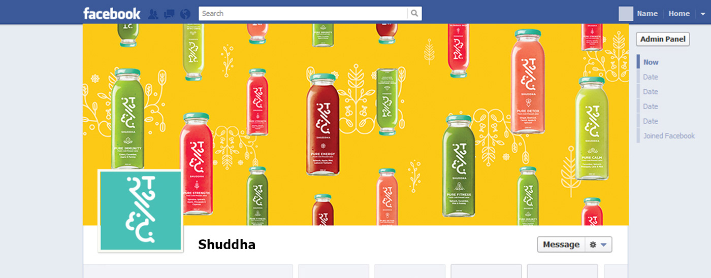
Based in New Delhi, Shuddha is a brand that aims to encourage a wholesome and healthy living through their foods. Shuddha makes vegan juices, nut milks and some smoothies.
We started by reading into the brief and identifying the main keywords.
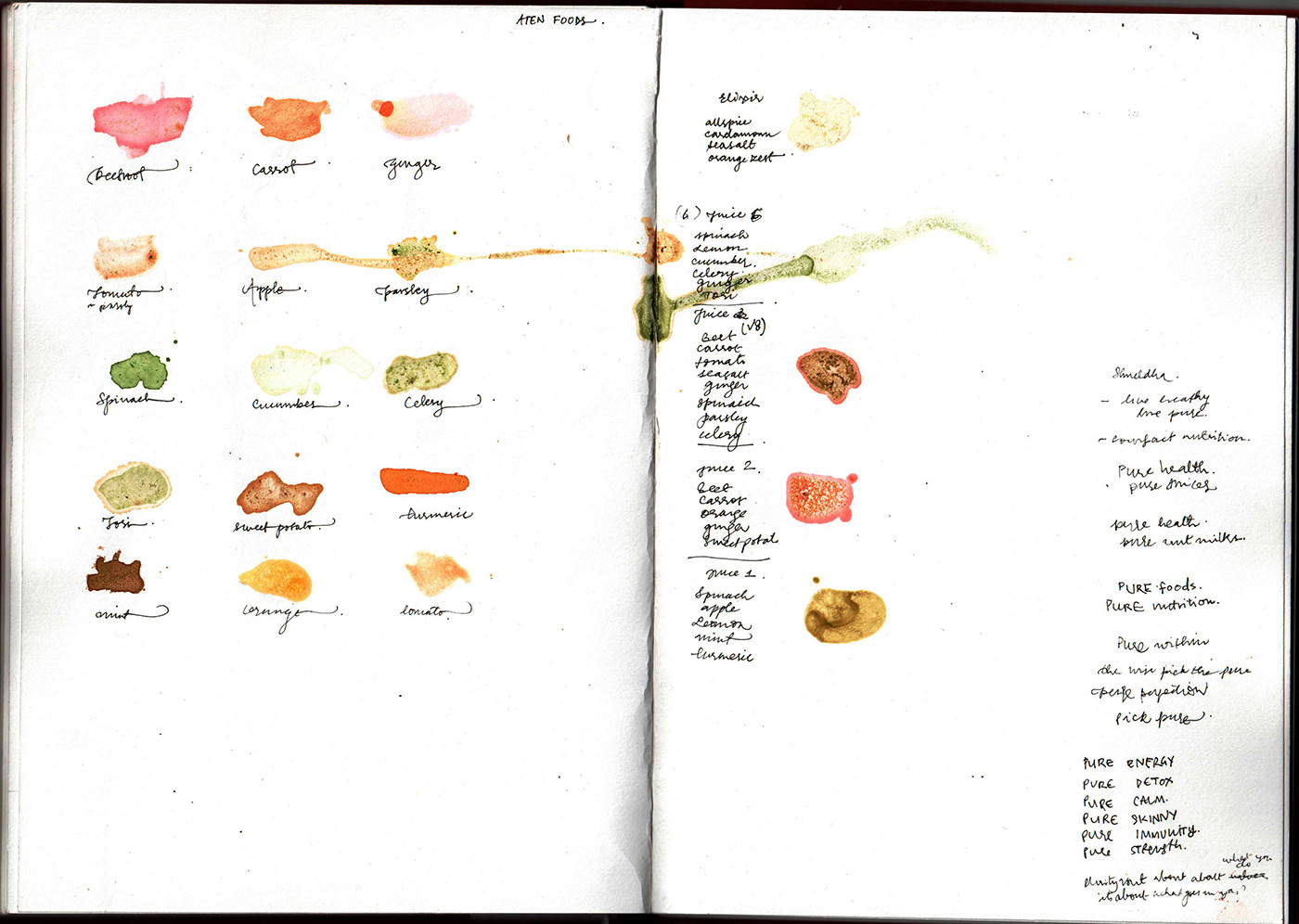
Raw, Vegan, Natural, Healthy, Lifestyle, Local, Green. Our understanding of the brand evolved over time.
Raw, Vegan, Natural, Healthy, Lifestyle, Local, Green. Our understanding of the brand evolved over time.
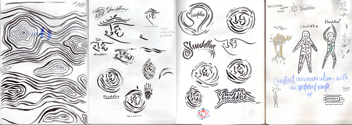
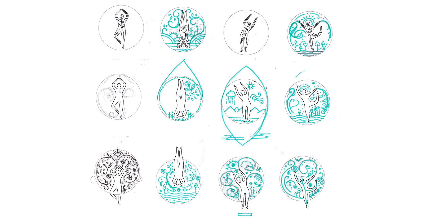
Visual exploration.
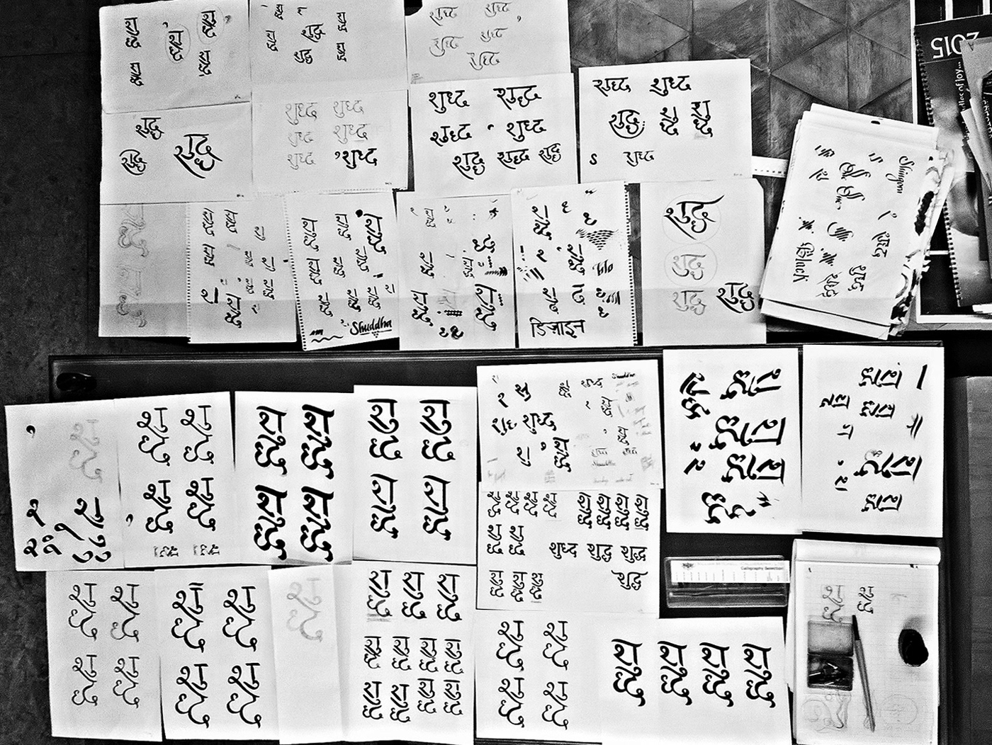
We decided to push for a devanagri logo, because the brand is called Shuddha, a hindi word which means pure.
Shuddha is an Indian brand catering to a local (currently Delhi) Indian audience, and the very fact that the name it self is in Hindi, drove us to explore Devanagri letterforms.
Shuddha is an Indian brand catering to a local (currently Delhi) Indian audience, and the very fact that the name it self is in Hindi, drove us to explore Devanagri letterforms.

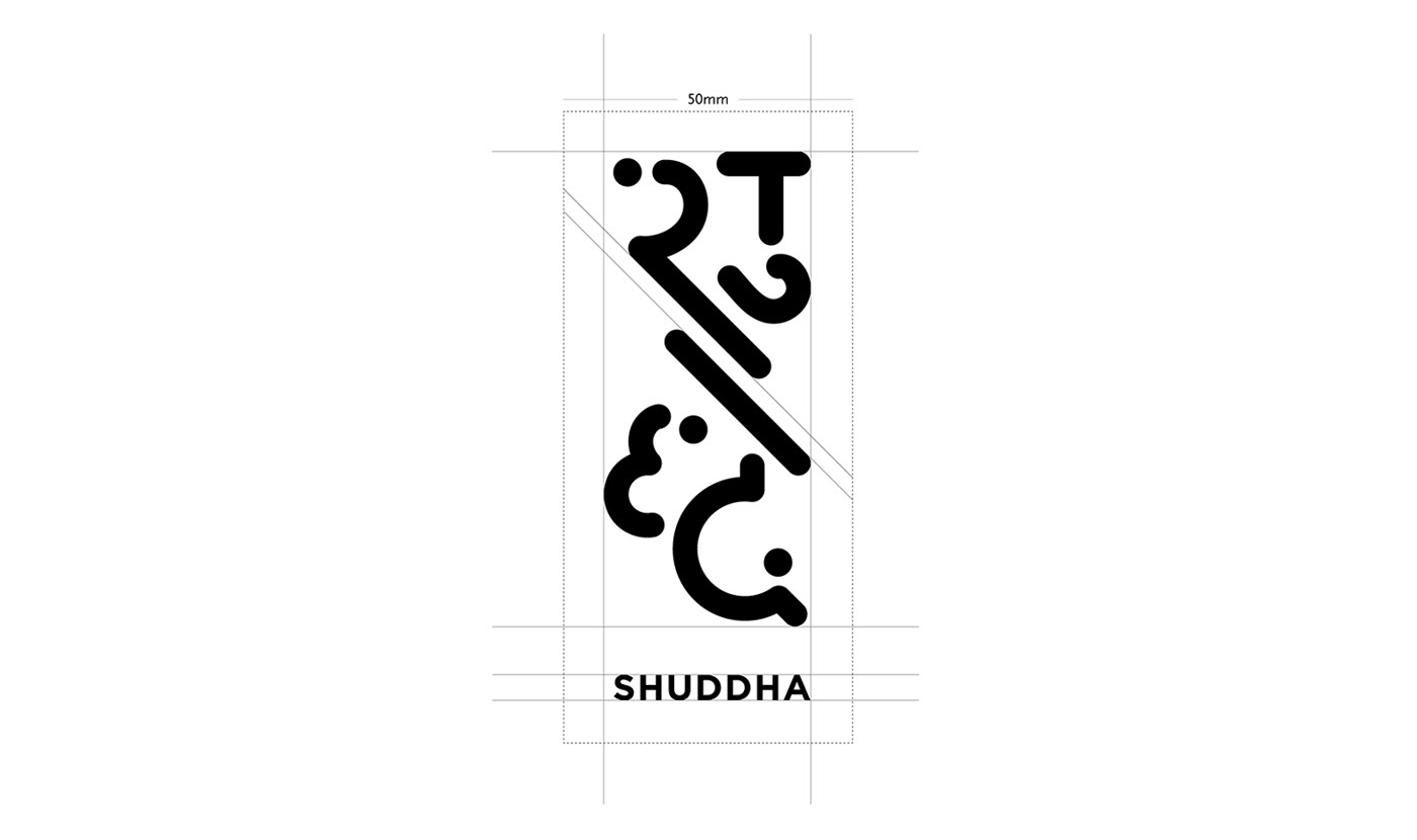
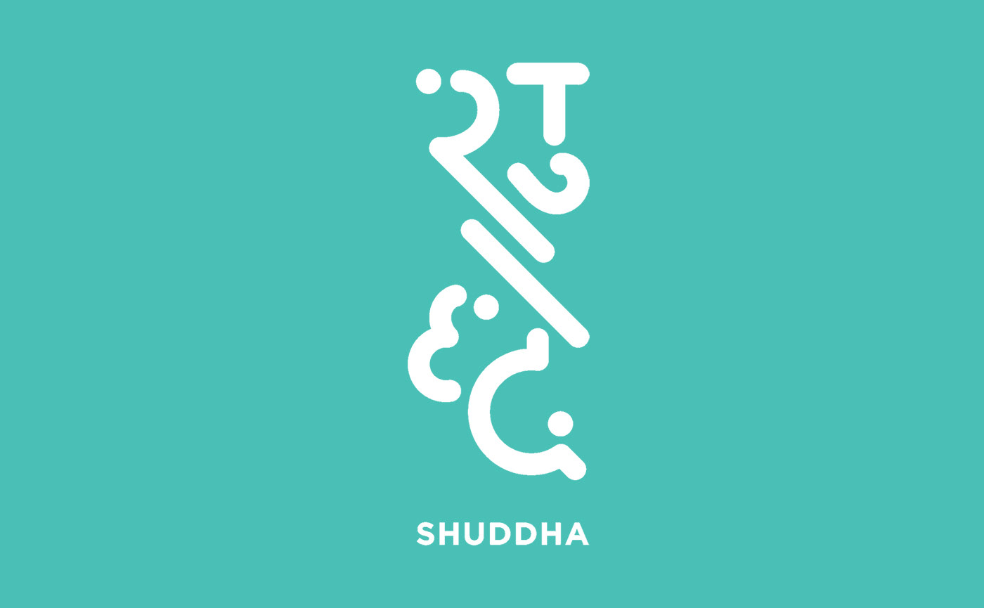
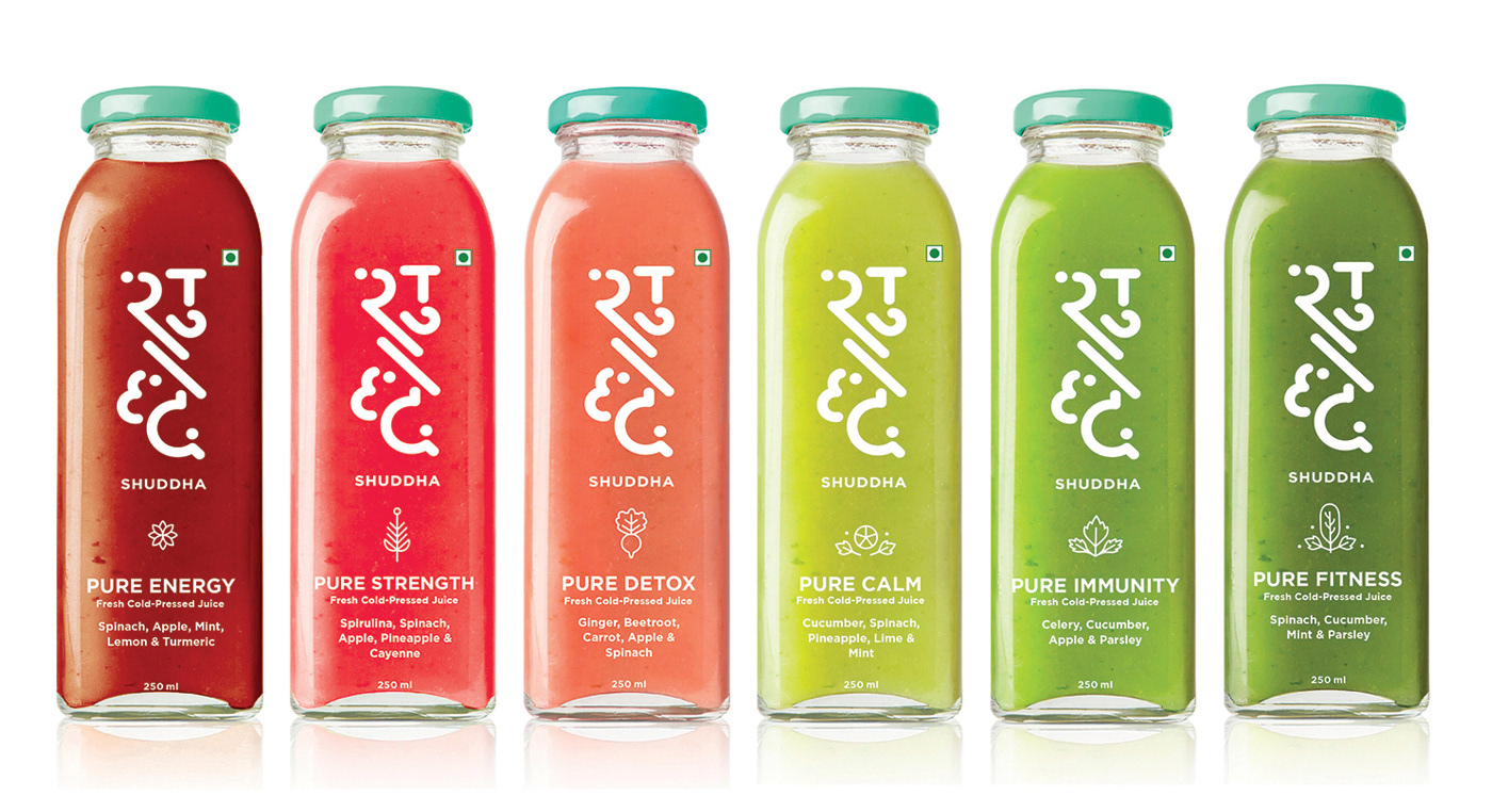
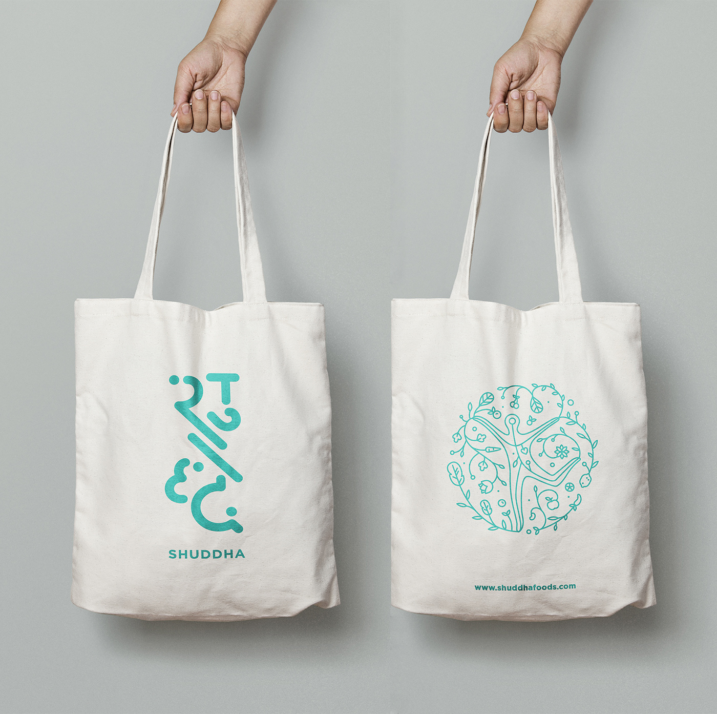
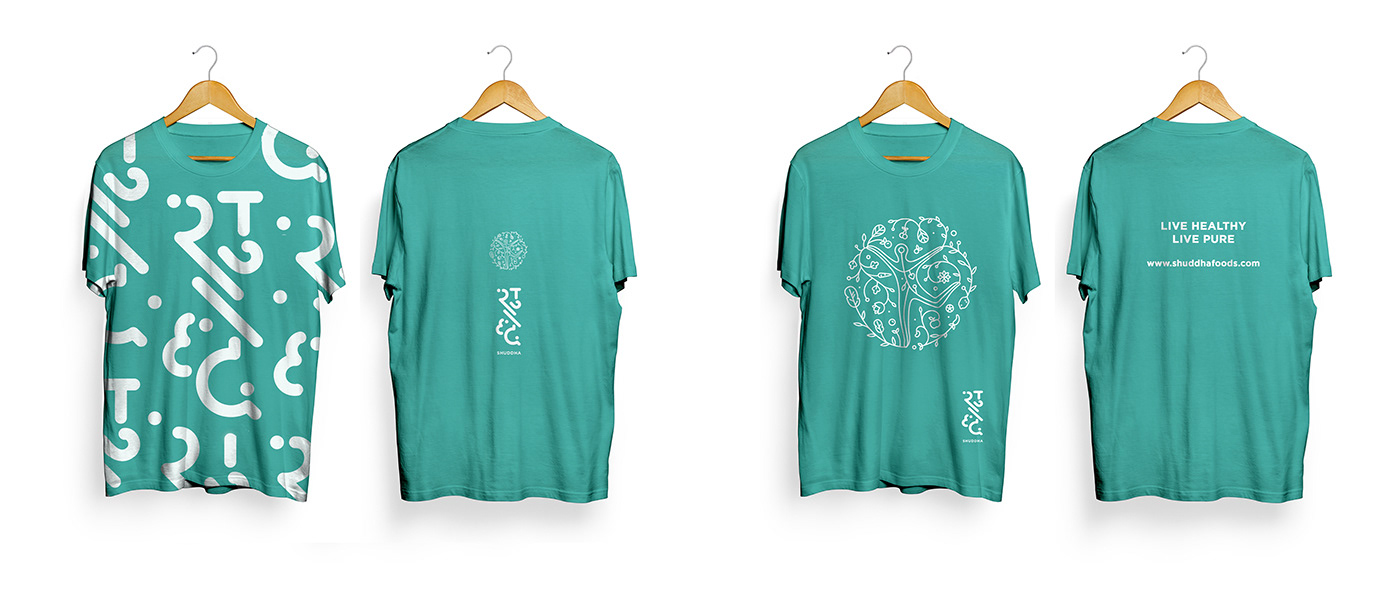
The final logo. Teal was chosen as the primary brand colour to signify health and wellness.
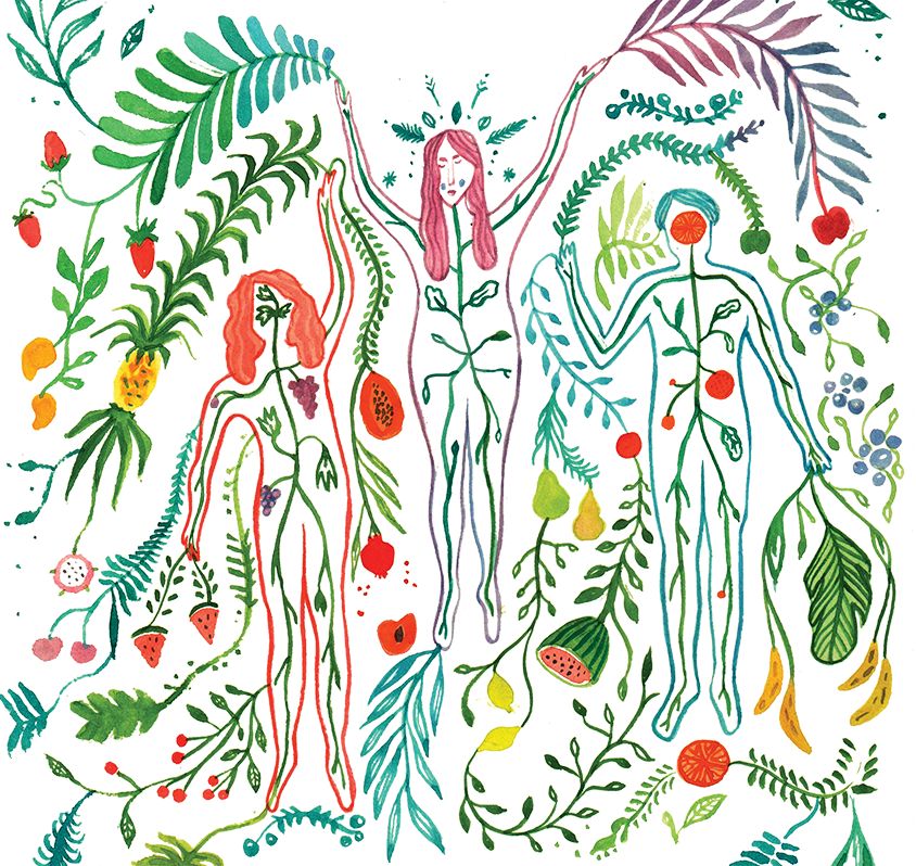
Communicating the importance of a healthy lifestyle.
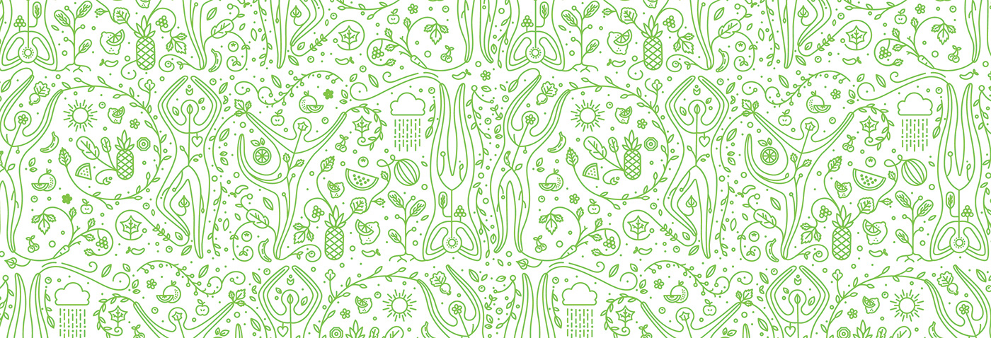
Using this illustration as a base idea, the form was refined to match the monolinear logo.
Using this illustration as a base idea, the form was refined to match the monolinear logo.
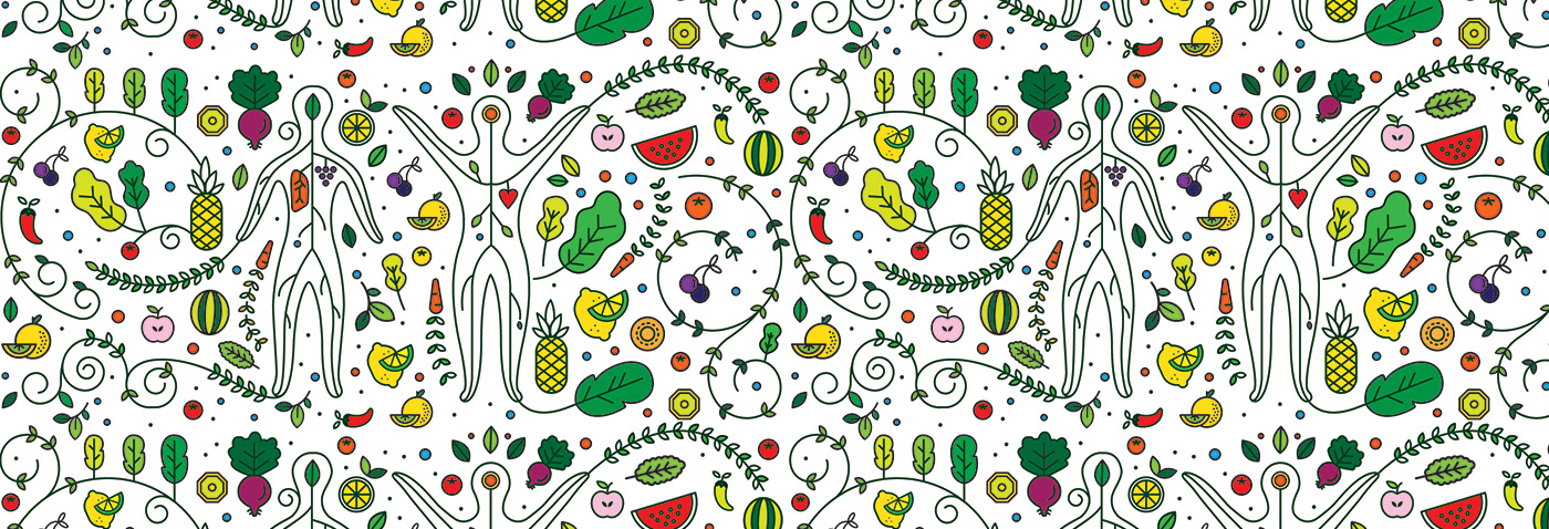
Inspired from yoga postures.
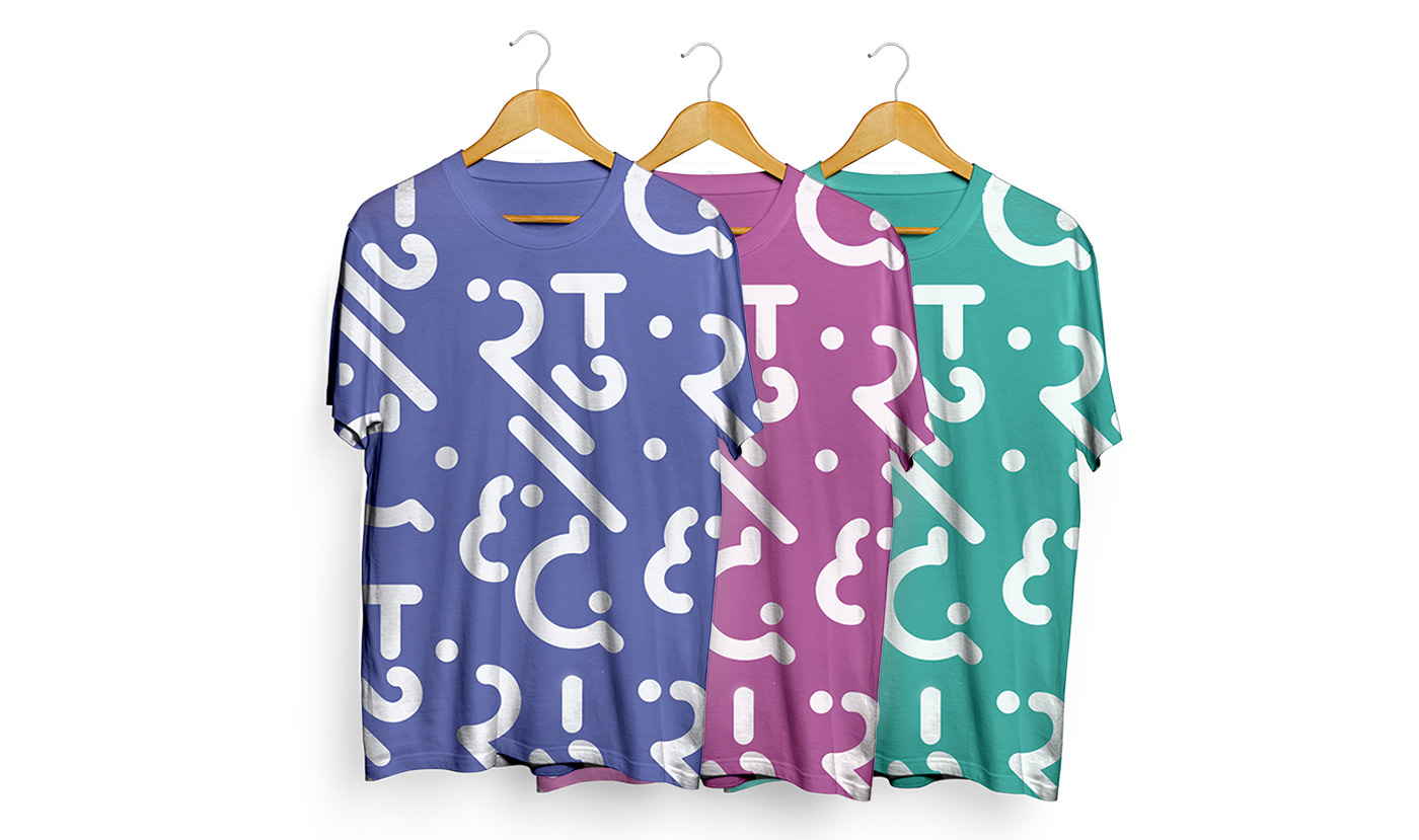
We realised that the pattern was looking to heavy and cluttered, so we broke down the illustration to individual units.
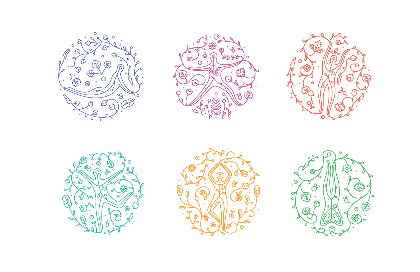
The final units. Each illustrative unit is for a different attribute of
Energy, Relaxation, Weight Loss, Immunity, Strength and Detoxification; which is how the juices are planned to be.
Energy, Relaxation, Weight Loss, Immunity, Strength and Detoxification; which is how the juices are planned to be.


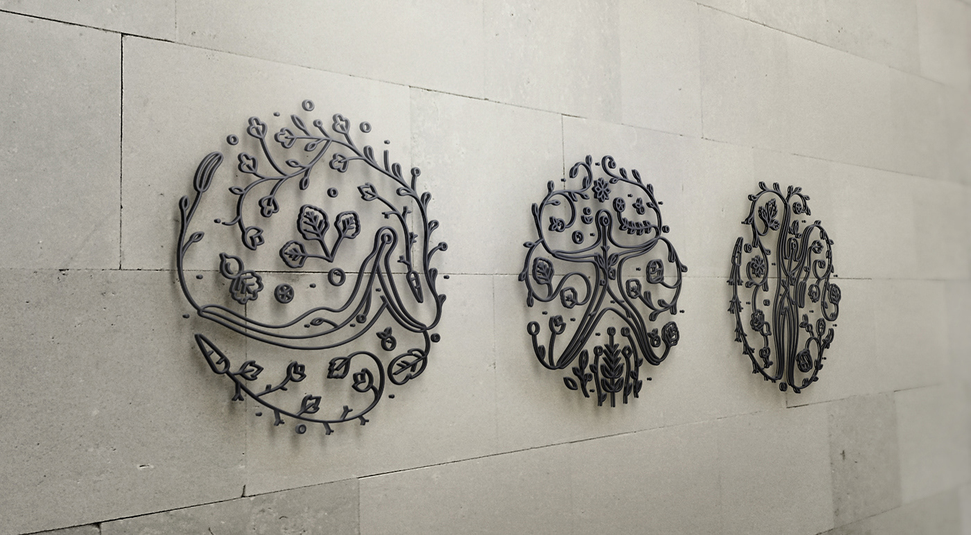
Wall mountings

This project was guided by Mr. Tarun Deep Girdher, Sr. Graphic Design faculty, NID. I was also mentored by Mr. Sudeep Chaudhuri, Creative Director, Green Goose Design. Credits to the entire team at GGD; VR Mukund, Prateek Bhargava, Sakshi Babbar, Vinay Gupta, Bhagirath Vagamshi and Jasvinder Singh.
Read the entire branding process here.
http://issuu.com/ishitajain24/docs/identifying_shuddha_ishita_jain_iss
http://issuu.com/ishitajain24/docs/identifying_shuddha_ishita_jain_iss